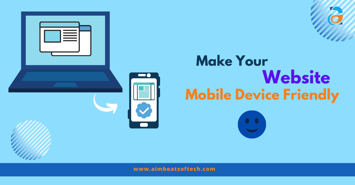
Are you not happy with your website that you see on mobile device. It does not look the same way it looks on desktop is it? So, here are the few simple techniques with which you can make your website mobile device friendly. If you analyze your website on google analytics you will come to know that most of the visitors that you get are from mobile devices. Because there are more number of mobile users than desktop users in the world. Smartphone world is is penetrating even in the small villages. Thankful to the mobile network companies which help anyone to access anything on internet from any corner of the world. So, it is clear that your good presentation of website on the mobile phones is utmost important.
Here are some simple ways to make your website mobile device friendly:
Testing your Website For Mobile Device Friendliness
Before moving towards making website mobile device friendly it is important to know that where it is lagging and where there is a scope of improvement to make it mobile friendly. You can check the mobile friendliness of the website from many tools available on the internet. Many of those are free to use. You may also use google tool to check the mobile friendliness of the website. This tool is super easy, you just need to put your website page url and there you go. The results are there in front of you.
You can also test yourself by simply putting your url on your own smartphone. You will come to know about how it look and feel like and how you want it to be.
Choose a Responsive Theme
Developing a good websites needs lot of important things that need to consider beforehand. Choosing a better theme is one of them. Because now a days websites are mostly build on WordPress because of its popular plugins and ready to use themes. If you are the one with WordPress websites then make sure your are using responsive theme for your website. This theme makes sure that the website user will get the seamless browsing experience. As this theme makes your website responsive as per the change in device, browser and screen size. From wherever your user access your website it will automatically change its appearance as per the device that they use.
Choose Your Web Host Wisely
Choosing the web host for hosting your website is one of the vital decision that you need to take. As the speed of your website mostly depends upon the type of host you go with. So, take a wise decision and get a best host who can assure you best website speed. Remember that poor website speed means more bounce rate. More the bounce rate, less will be the website performance on mobile device. Mobile device needs faster websites than desktop devices. Because mobile device CPU, memory and cache size are much smaller than a desktop’s.
Loading Time Improvement
Sometimes it happens that even after choosing best host, your website does not perform well with the loading time. It may happen because you have chosen bulky images and videos that takes time to download. There are many other things with which you can make your website speedier. Such as enabling compression, CSS and java-script minification, reducing redirects etc.
Related Article : Impact of Software Development on the Potential Economic Growth
Redesigning Pop ups
Using pop ups is sometimes criticized, but still those are the important weapons to attract your customers attention. You can pass on important information to your website users through pop us as they attract users attention to the most than any other things on the website. But these pop ups can also create nuisance to the end user and they may feel it difficult and annoying to browse your website further. So, it is important that you keep the pop ups to the minimum. Specially on the mobile devices, as they create more nuisance over there. You can redesign pop ups specifically for mobile devices, make it minimum sized, easy to close and user friendly.
Enabling Accelerated Mobile Pages (AMP)
Google has launched Accelerated mobile pages also called as AMP to get mobile user a seamless experience. With the help of this technology you can improve a lot on your website performance for mobile device. AMP is basically one more version of your website, which will be easier to access on mobile devices. With this version of website your website speed increases to the most and it totally becomes mobile device friendly.
Hire A Better Website Development Company
Last but not the least, if you want your website to be of great value and perform its best on mobile devices, then hiring a good mobile app development company will help you a lot. Good mobile app developers will make sure that your mobile website speed will always remain on higher side, it will remain bug free and serve the reason for what you developed it.
Aimbeat is the topmost software development company in Mumbai, who can promise you to get your end user a seamless browsing experience on your website.
You may reach us on +91 2249743701, +91 8655599996, 9699925003.
We would love to hear from you.


